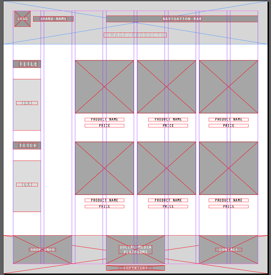
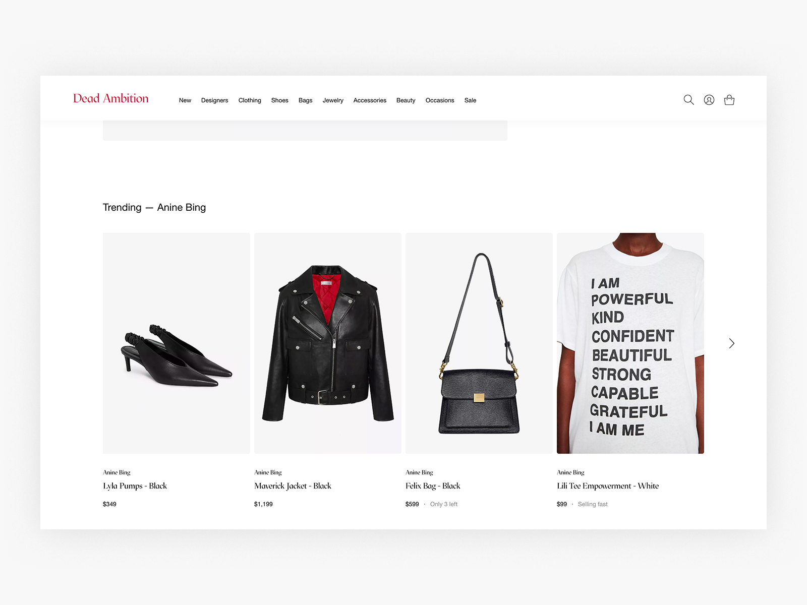
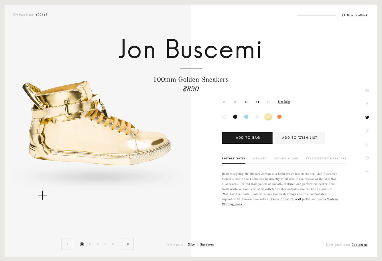
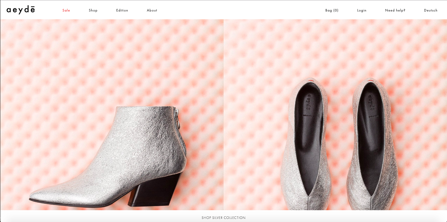
Wide screen comps
Homepage, Menu, Product page, Detail page
source : Behance
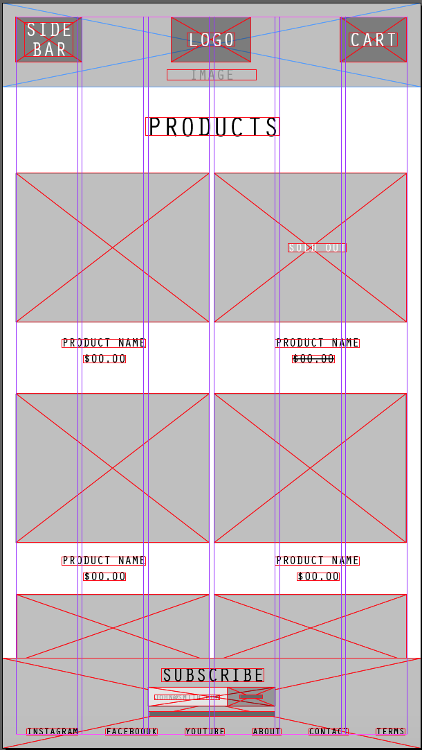
Mobile screen comps
Product page, Detail page
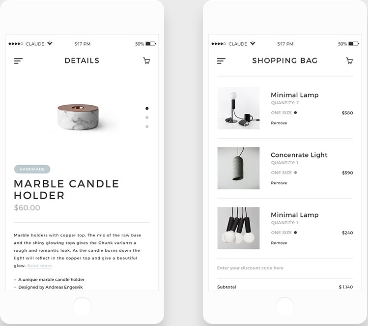
Source : Behance
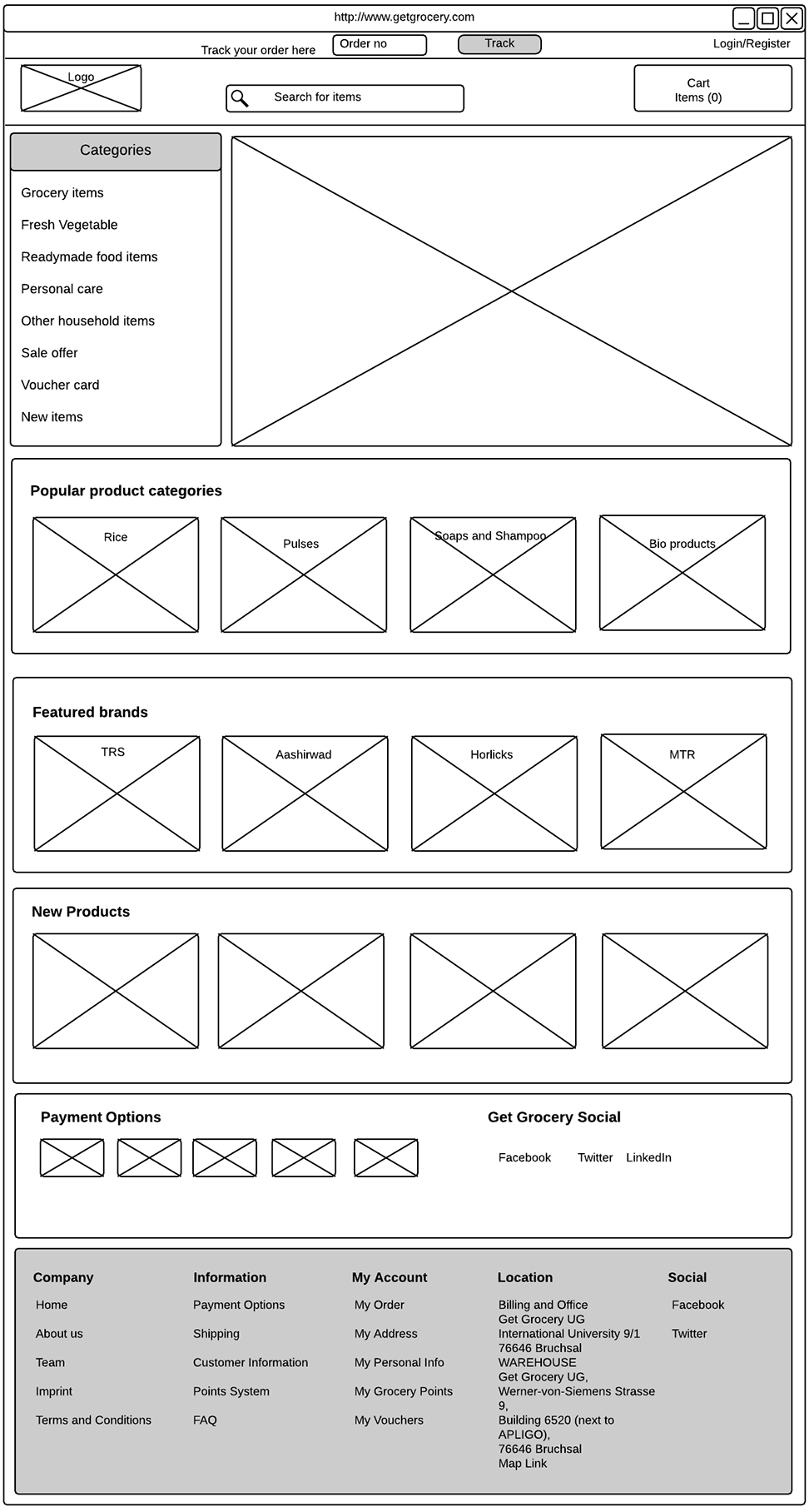
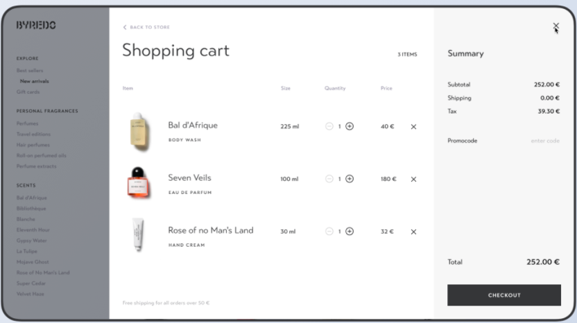
Wide screen to mobile screen solutions
reading app
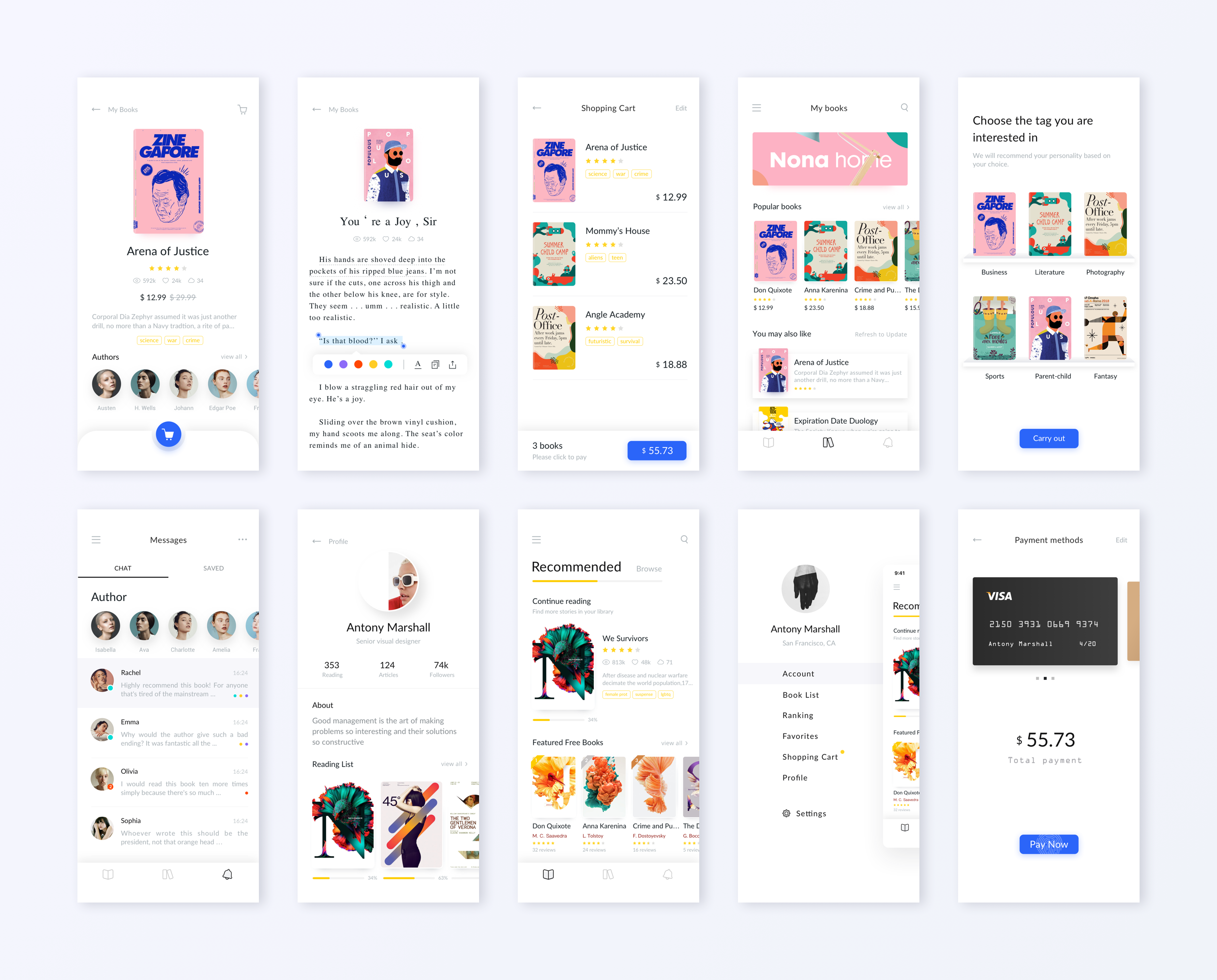
Source: Dribbble
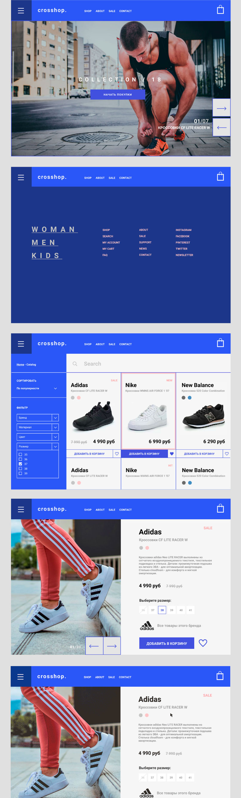
Design applying design principles of:
A)Proportion
B. Balance
(symmetrical in this example)
C. Use of repetition 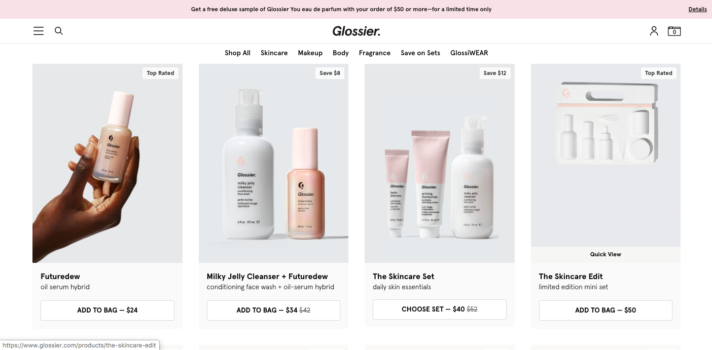
D. Proximity
E. Grid
F. Hierarchy
attracts attention. organizes what is important. guides the user.
Tools: size | contrast | white space | grouping | weight (bold) | boxes etc.
Some rules for typography on the web:
-Avoid too many typefaces. Three is enough for the types of text in your page (navigation, main text, and headers). You can also achieve variation with size and weight using the same font.
-Nav: avoid serif fonts (it's less legible in small sizes)
-Main text: avoid caps, and centered text (left-aligned is more legible.)
-Avoid busy and colorful images behind text
-Be aware of color contrast (color contrast test).
-Wide screen: Minimum size is 12-point. Line length : 8 words per line. max
-For mobile screen: double font size and limit to 5-6words per line
-Use white space wisely to achieve grouping