Typography in design
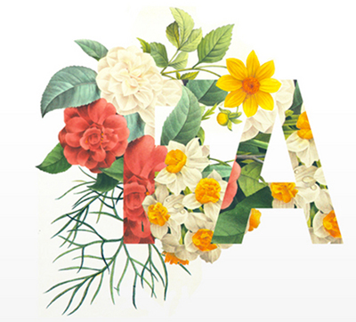
In design, typography is a visual element.
When you are creating the branding, choosing type is like choosing the voice of the brand.
The categories of typography that are needed in designing a brand and most design projects would be :
1) display type (type that is used for display) for social media, etc.
2) headers (can also be used in social media, print, web for titles.)
3) subheaders (complement the headers)
4) main text which is the longer and smaller text you will need in email creatives, website, print (magazine etc)
If you are creating a typographic logo, you would also have to choose type for the logo.
Typography principles. Basic terms.
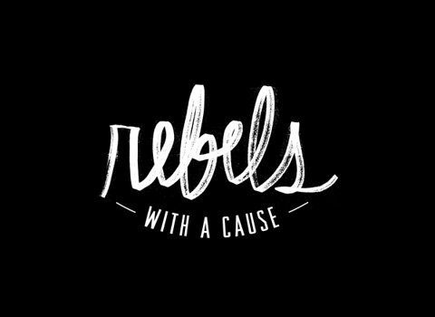
Difference-between-type-and-lettering
source
On choosing type
Source
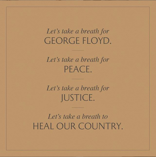
1. Honor the content :
Choose a font that is appropriate to the message
2. Honor the reader :
Choose a font that is readable, appeals to the audience
Categories of Fonts
1.Serif:
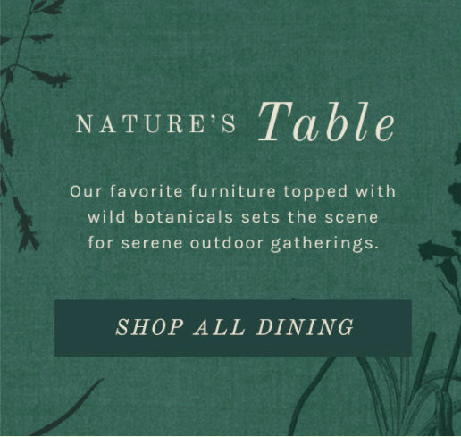
Serif fonts have extra elements such as "footers" and "angles" attached the ends of their letters.
Serifs are generally considered more traditional choices than sans-serifs.
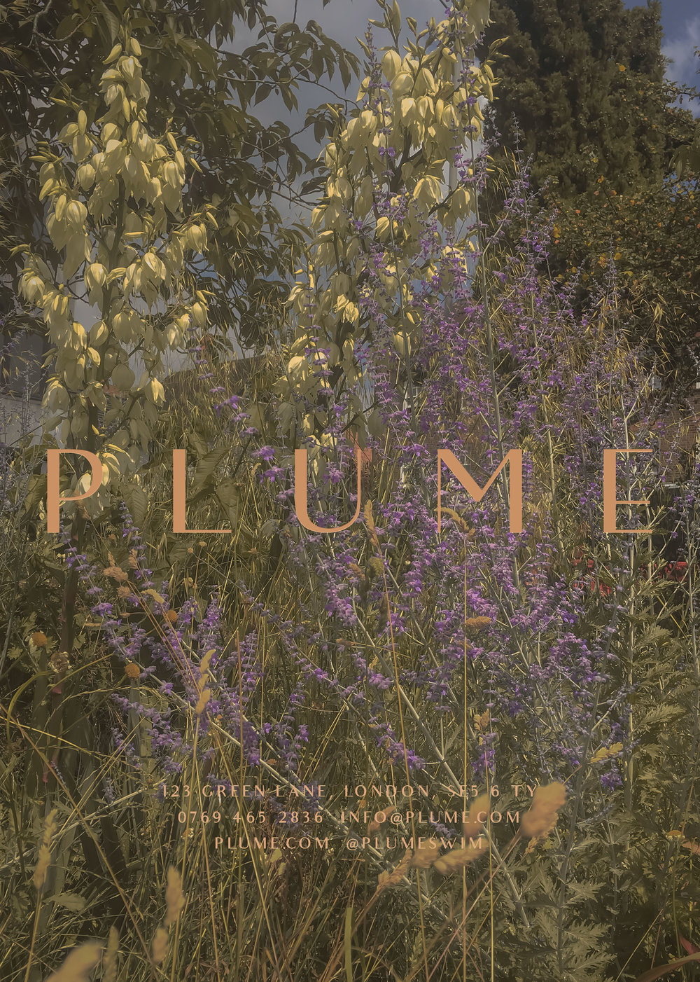
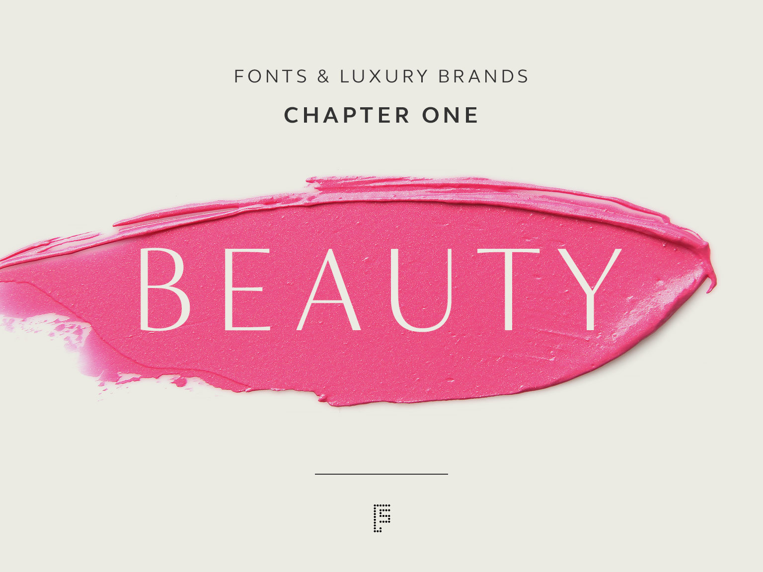
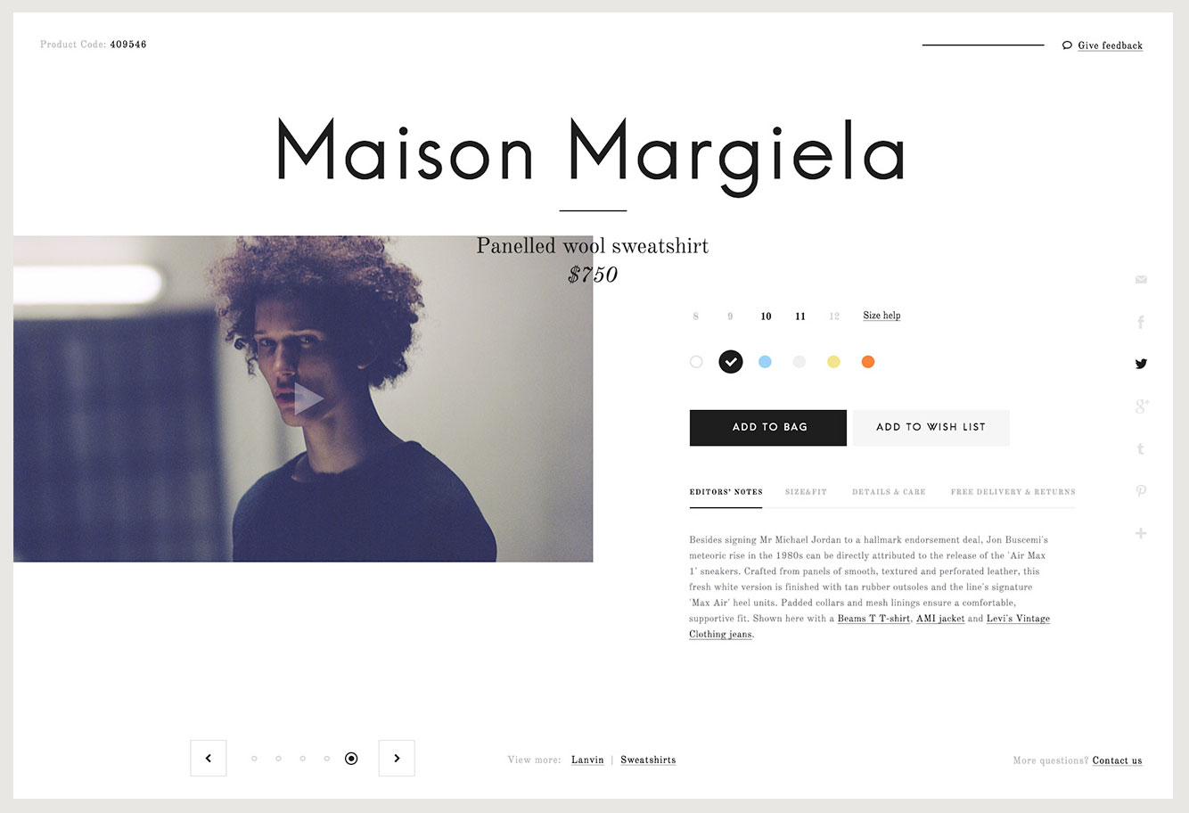
A lot of fashion brands and luxury brands use serifs.
Slab-serif is a sub category of serifs.
reference : serif-vs-sans-serif
2.Sans-Serif:
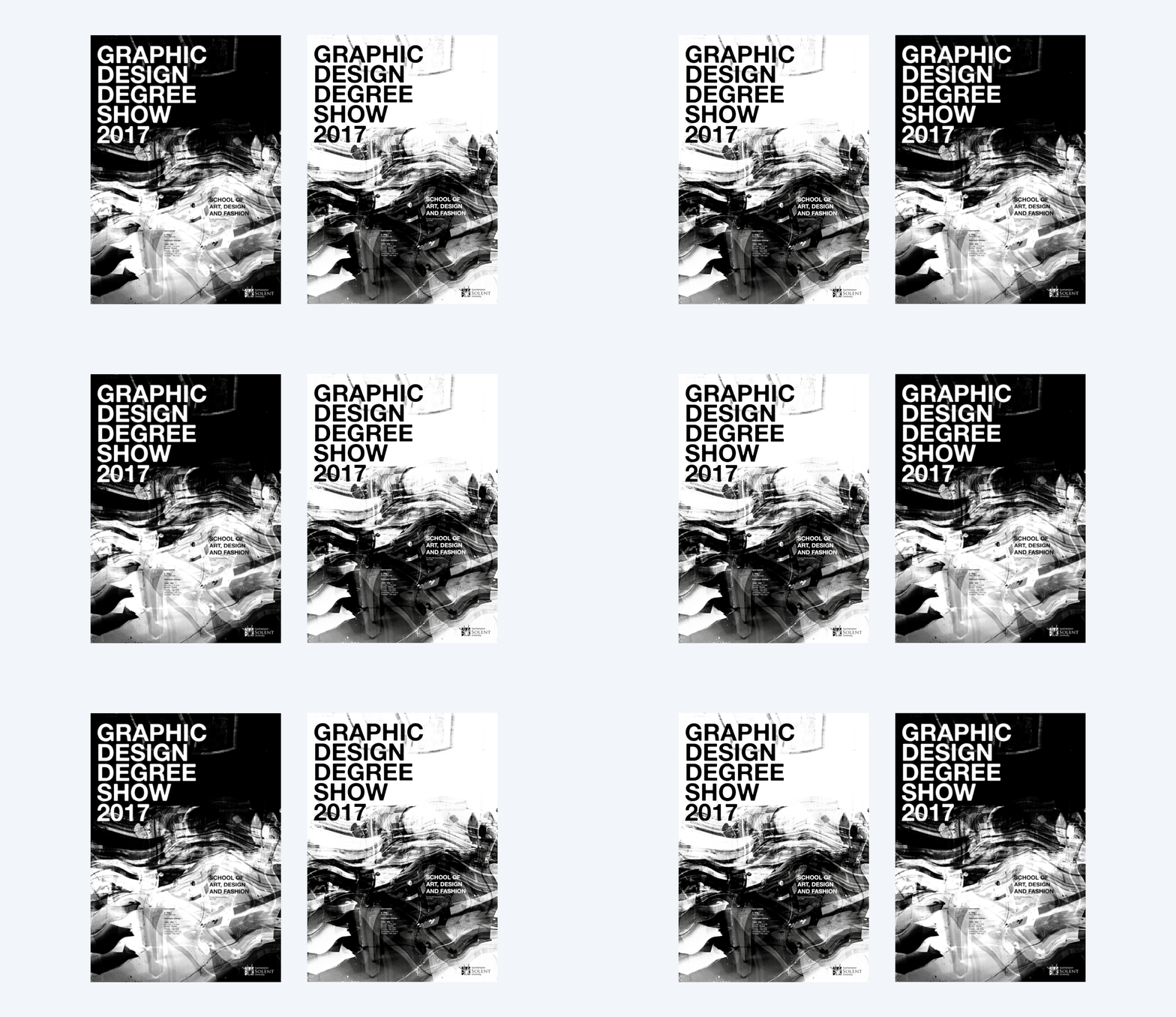
source
Sans-Serif literally means without serif : these fonts don’t have the extra parts on the ends of letters.
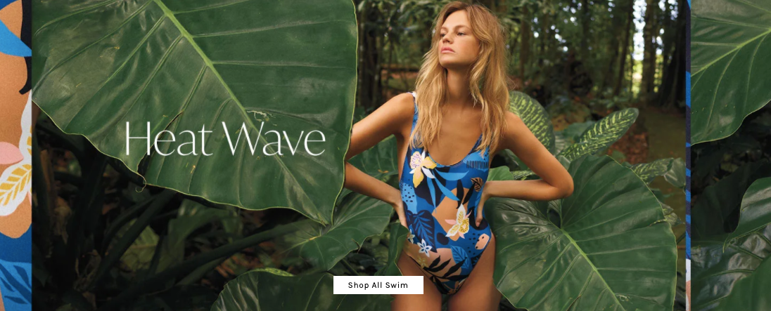
Sans-serifs are generally considered more modern design choices.
For longer text, it's said that serifs are a better choice for print text because it's easier navigate the text visually, helping move your eyes along the lines (this is debatable).
For screen-based text it' said that serifs don’t display as well on pixel-based screens (looking distorted and “noisy” rather than clear and crisp), so many designers prefer sans-serif fonts for web use, especially at small sizes.
3.Display:
Fonts designed for effect (not for main text that is usually small and dense).
reference : display-type-vs-text-type
4.Monospaced
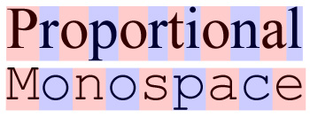
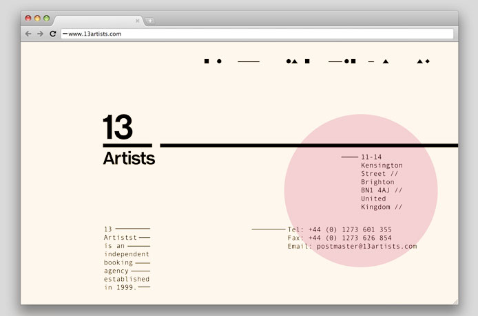
5.Hand-written and script
Font properties

leading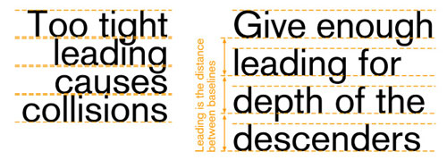
kerning
On matching fonts:
1.Pair a distinctive font with a “strong personality” (i.e. a display font), with a more neutral and conservative font to create balance.
2. Contrast : Pair fonts that create contrast
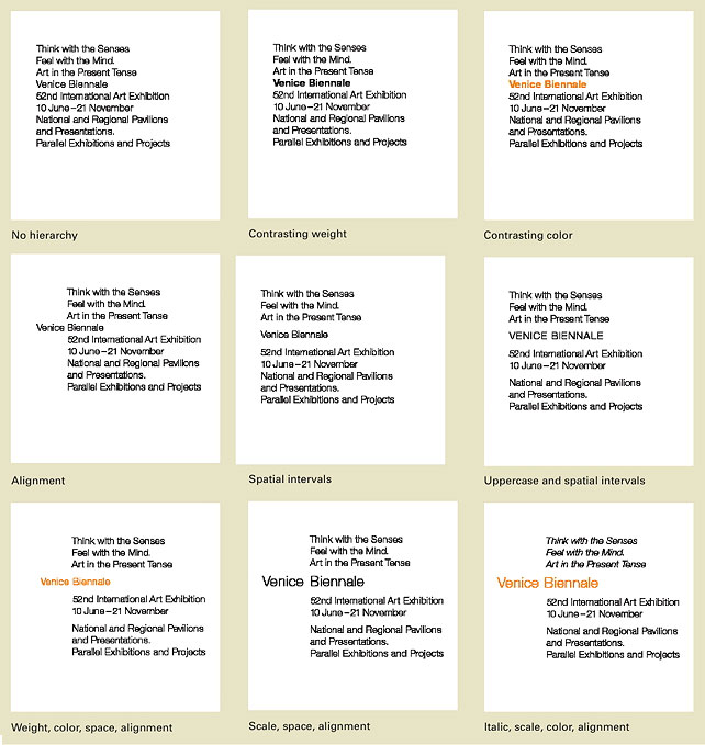
3. Establish a visual hierarchy:
Separate different textual elements like headlines, sub-headlines, body copy, and captions. Size, weight and spacing allcontribute to hierarchy.
4. Choosing fonts from the same family can create harmonious results
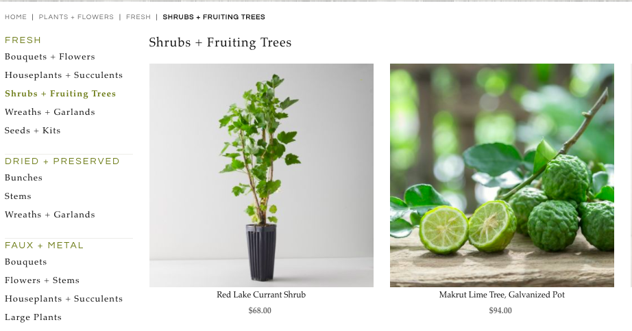
reference : guidelines-for-combining-typefaces
Type as visual element

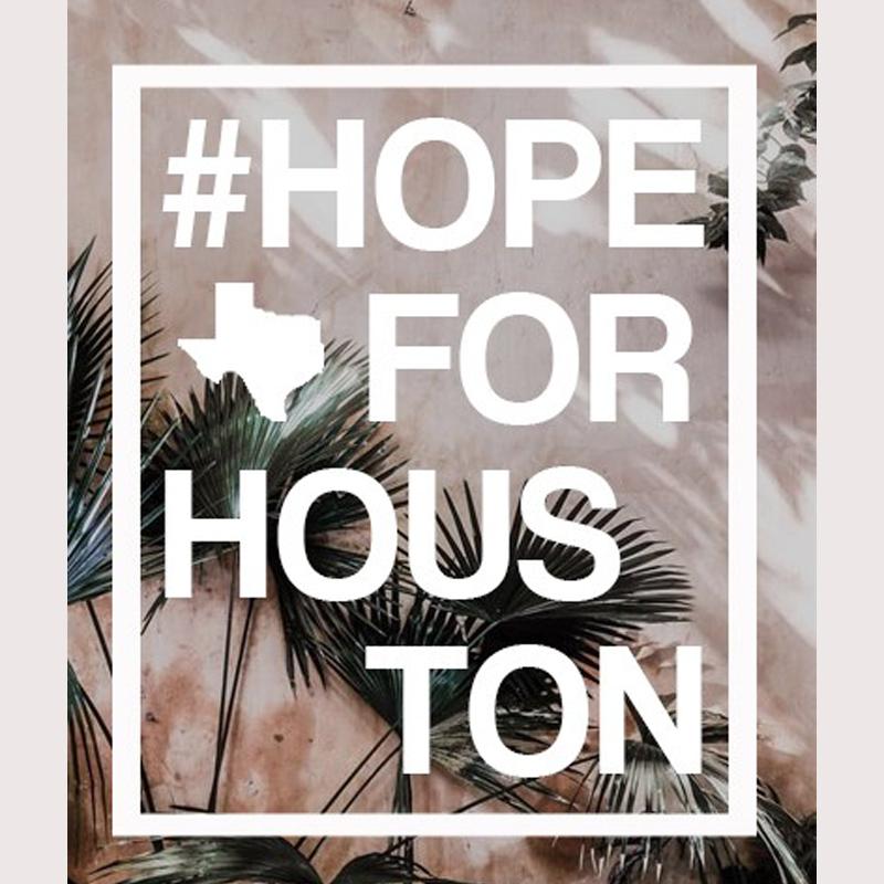
references: Character Formatting | Formatting-paragraphs
Filling type with patterns.
